Guggenheim: Bringing Art to the People By Design
My Role: Full-Stack UX Strategist | Sprint: 1.5 Weeks
Project Status: Complete
Guggenheim: have you heard of them? It’s a formidable family of global museums characterized by amazing architecture, but you probably knew that.
The architecture is a landmark of design and accessibility, but the same can’t be said for the website, a Byzantine labyrinth of archives, blogs, and art.
Inspired by the work of Frank Lloyd Wright, we imagined a partnership with Guggenheim to redesign their flagship site.
Unknown Artist
Guggenheim Homepage, 2020
CSS on HTML
Problem space
How might we help passionate visitors find information and opportunities that deepen their relationship with art?
Our Solution
We deconstructed the website and analyzed it against Abby’s Heuristics as well as tree studies and card sorts to test its navigation and usability across 10 areas.
We made a simplified, accessible site that brought functionality to the forefront.
Design Goals
Streamline the guest to member and guest to visitor flow.
Consolidate categories and reduce cross-linking to avoid lost users.
Compartmentalize Guggenheim New York and global Guggenheim.
We made:
Reduction in top-level navigation links from 24 to 7.
Research and archives in one section.
“What’s on view” to streamline visitor journey.
Renamed navigation items according to user research.
Wright building-inspired color palette and design.

Research
1: User Research
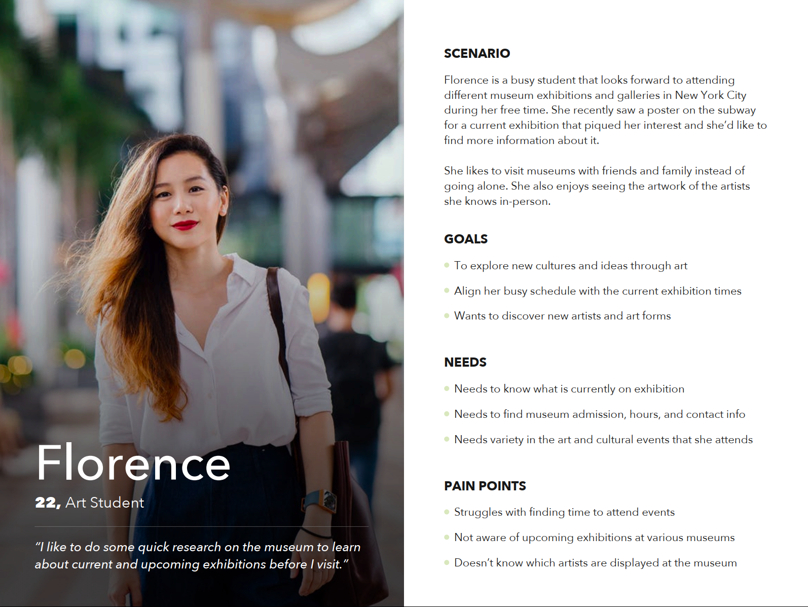
We started by putting users at the core of our design.
We started by getting to know a demographic that both used the Guggenheim website and frequently visited the museum. We summarized those insights as Florence and designed for her needs.
We learned where the site wasn’t meeting Florence’s needs
Categories had too much overlap.
Planning a visit was a source of frustration.
It was hard to find items in the collection and see if they were on display.
expand >
2: Heuristic Evaluation
We systematically compared the site against Abby’s Heuristics.
The site was usable on a surface level and contained a vast amount of information. It behaved predictably and conveyed a lot of credibility
Unfortunately, the site was also failing in visual and mobile accessibility and was ultimately forgettable: definitely off-brand.
Now that we knew the site, we tested its information architecture. The content was well-displayed, but how was it organized?
Original site heuristic scores
3: Navigation Studies
We tested the current navigation with users and let them show us where they expected to find things.
Card sort: users showed us that they couldn’t find key information or agree on where they expected to find it. The red lines indicate consistently sorted pages.
Design
We took what we learned and made a streamlined site
By reducing the number of top-level categories, we transformed the maze-like navigation and streamlined it based on what users actually needed and understood.
We took Wright’s principles of organic simplicity and made a site that delights
A visually accessible, empathic site paid homage to the museum’s distinctive shape and color palette.
High Detail Usability Results
Takeaways
Design must be empathic and balance the needs of many: corporate Guggenheim, Guggenheim NYC, and visitors.
Research early, research often. Such a large site is laborious to redesign.
Accessibility can be balanced with delight.
Look to nature for proven designs.
